Maria Jeglinska
Office
for Design and Research

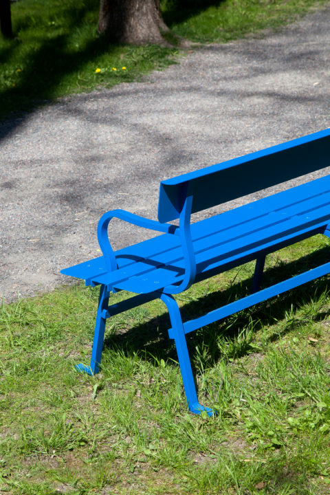
PORTARE, Self-commissioned, 2024
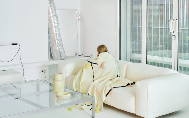
Flaner, Mdd, 2024
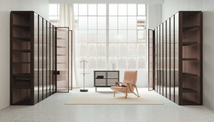
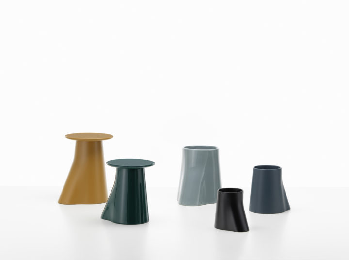
Series 3 - New Works, Plato, 2022
Arco, AHEC x Benchmark, 2020
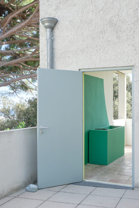
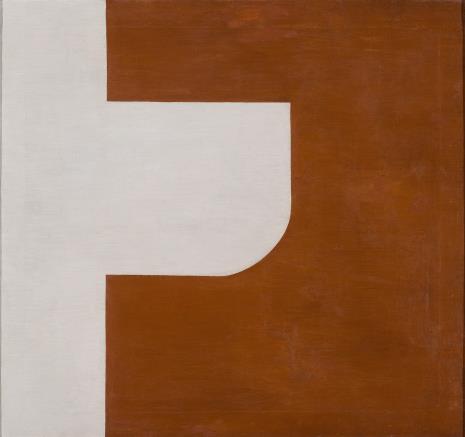
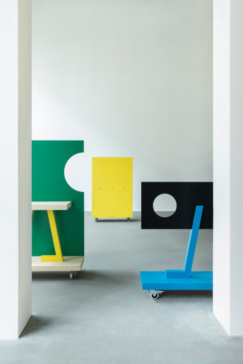
Portable Walls, Museum of Decorative Arts, 2019
Maria Jeglinska Office for Design and Research

Information

Maria Jeglinska-Adamczewska
Office for Design and Research

mail (at) mariajeglinska (dot) eu
Warsaw, Poland

Maria Jeglinska-Adamczewska, Office for Design & Research was founded in 2012 and is based in Warsaw, Poland. The office works on industrial design projects (products and furniture), exhibition design, curation and creative direction as well as research-based projects in the field of design.

Exhibitions

  • Connected, Design Museum, UK, 2020
  • L’été à Hyeres, Villa Noailles, France, 2020
  • Social Seating, Fiskars Village Biennale, Finland, 2019
  • In Circulation, Portable Walls, IMM Budapest, 2019
  • Between Area and Space, 28thInternational Biennal of Graphic Design Brno, 2018
  • Is Coral a colour?, Superstudio, Prague, 2018
  • Typecasting by Vitra, Milan Design Week, 2018
  • My Canvas by Kvadrat, London Design Festival, 2017
  • Arrêt sur Image, Design Parade Hyeres, Villa Noailles, 2017
  • Breakfast Pavilion, A+A Gallery, Venice, 2017
  • Cadavre Exquis: an Anatomy of Utopia, London Design Biennale, 2016
  • Future Stars?, Aram Gallery, London, 2014
  • Wonder Cabinets of Europe in America, ICFF, New York, 2013
  • La Ville Mobile, St Etienne Design Biennale, 2010

Clients

  • 1882ltd
  • AHEC
  • Aprile handles
  • Autor Rooms
  • Hermès
  • Kvadrat
  • Ligne Roset
  • Mdd
  • Puro Hotels
  • Trame
  • Vitra
  • The Adam Mickiewicz Institute
  • The Museum of Modern Art in Warsaw
  • London Design Biennale
  • Villa Noailles, Hyeres
  • Lodz Design Festival
  • Fiskars Village Biennale

Press

About

Maria Jeglinska-Adamczewska was born in Fontainebleau in 1983. In 2012 she established her Office for Design & Research. She graduated from ECAL’s industrial design course in 2007 and was awarded a scholarship from the IKEA foundation that led her to work for Galerie kreo in Paris, Konstantin Grcic in Munich and Alexander Taylor in London.
She works on a wide range of commissions: industrial design projects, exhibition design, as well as research-based projects in the field of design. She is convinced that in today’s world, research can trigger and generate new forms of answers and offers. Her clients include amongst others: Ligne Roset, Kvadrat, Actus, Vitra, 1882ltd, the St Etienne Design Biennale, the Museum of Modern Art in Warsaw. 
Her work is regularly exhibited internationally and was shown at: the Villa Noailles, the Aram gallery, Barbican Art Gallery, Centre Pompidou Metz and the Triennale di Milano. In October 2012 she curated and designed: “Ways Of Seeing/Sitting” at the Łódź Design Festival in Poland. She was also the co-curator and designer of the Polish Pavilion at the inaugural London Design Biennale in September 2016. In 2018 she was appointed creative director of the ARENA DESIGN Fair in Poland.

PORTARE

Self-commissioned
Furniture
2024

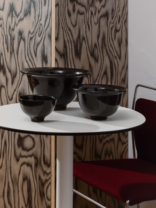
A side table combining two typologies, a bowl and a table. Two horizontal elements, at the top, a flat round surface and at the bottom a large bowl serving as the the side table’s base, connected together thanks to a stem. A small portable helper light enough to be carried around everywhere meeting the user’s changing needs.

Numbered and turned in solid ash wood and other varieties of solid wood.

Flaner

Mdd
Furniture
2024

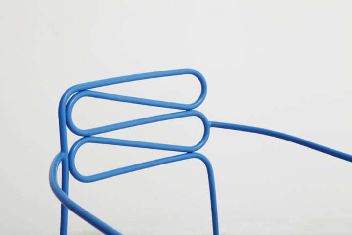
Flaner is an outdoor collection designed by Maria Jeglińska-Adamczewska for the Polish brand Mdd. In her typical way, the designer started with drawing.

– Initially, I started drawing from my head and from memory without delving too much into the subject of metal outdoor furniture. It was intentional – I wanted to recreate the form of urban and garden furniture intended for outdoor public spaces. I wan- ted to achieve the archetype of the chair. I wanted viewers to immediately recognize its function and purpose, and at the same time, to see something intriguing and new in it.

At the same time, the unusual shape of the legs draws attention. This is the common denominator of the collection and the most recognizable element. The designer combined natural inspirations in an interesting way – the characteristic curvature of the legs’ chair and tables resembles tree branches – with formal inspirations – seating planes and table tops are graphic plays with form.

The surfaces of this furniture are like leaves. I designed them to cast interesting shadows and thus fit into the nice play of light and shade that can often be admired in parks or on streets lined with trees. – explains Maria Jeglińska-Adamczewska.

The collection encourages you to stop for a moment and rest, offering a vantage point. Its name itself – Flaner, refers to the concept of the flâneur – a passer-by, a wanderer and keen urban observer who wanders through the city without purpose. The furniture has been designed in a way that, on the one hand, refers to the tradition of the typo- logy of metal garden furniture, and on the other hand, uses a modern visual language. The collection blends in and harmonizes with urban space, although it is also suited for indoor use.

The collection includes: a chair with and without armrests, a bench, two tables, two coffee tables and a lounger (soon to be released). The entire collection is made out of steel tubes and steel sheets.

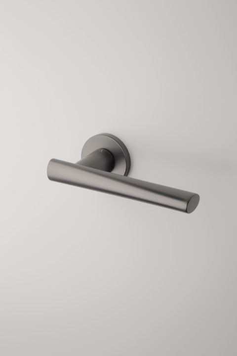
Euphorbia & Papavera

Aprile handles
Product
2023

Throughout the design process the basis was the quality of touch as well as the places where they could potentially be used, while keeping an economy of means in the form (a circle or an ellipse).
The door handles were designed for various spaces and contexts, both public and private.
All the handles designed for Aprile bear the name of plants, I chose the ones that were found in the South of France where I designed them.

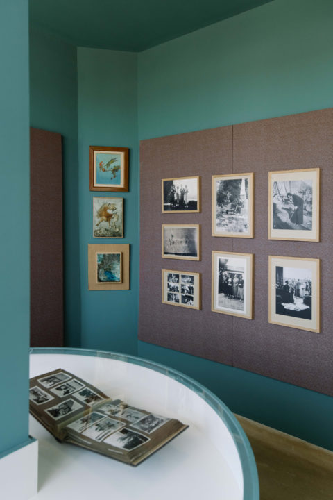
Archives Inédites

Villa Noailles
Exhibition design
2023

The exhibition showcases never seen before original albums of the Noailles’ from the 1930s.
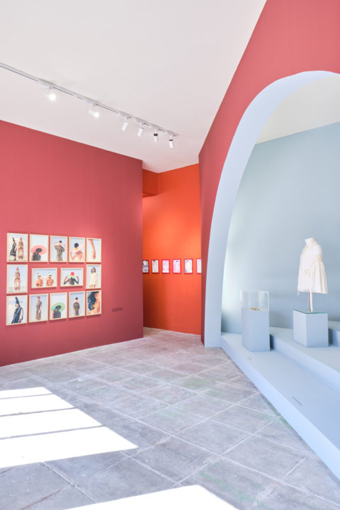
The exhibition design echoes the architecture of Mallet Stevens by diverting emblematic elements of the Villa. The column with discs from the pink living room becomes a showcase table. Nodding to Mallet-Stevens first job as a movie set designer, the cinematographic approach of the sequenced textiles frames give rhythm to the documents shown on the walls. In contrast with the rigor of volumes of the Villa, the vertical panels are covered with out of stock textiles.

The exhibition opened during the 17th Design Parade Festival organised by the Villa Noailles and runs through the end of January 2024.

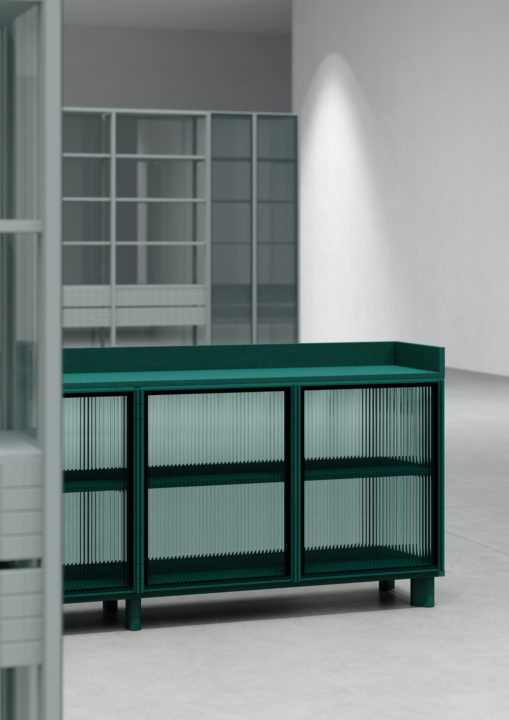
Series 3 – New Works

Plato
Furniture
2022

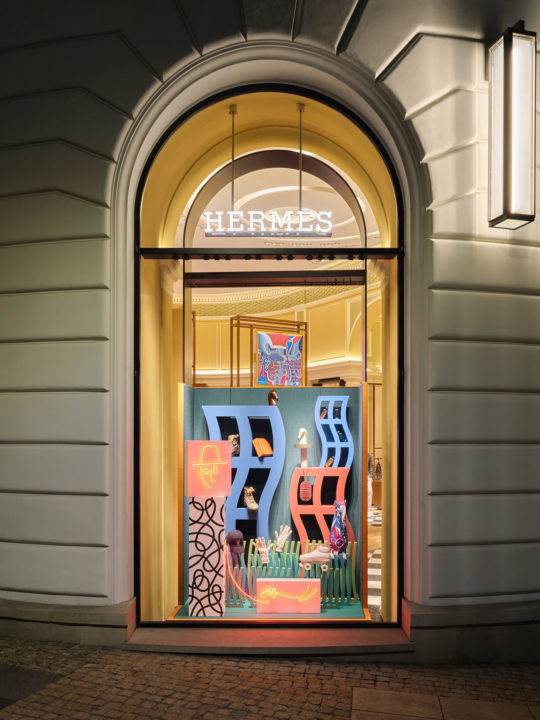
Lineness

Hermès
Window design
2022

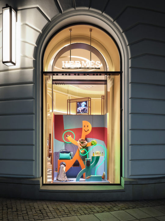
A humorous take on urban settings through line drawings. Humans taking the form of buildings. A dancing high-rise on feet comes indoor and reveals its content. A man on a walk in a park entangled in his dog’s leash, a strutting woman whose attitude resembles that of the urban fauna. The city as a theatre stage. Passers-by looking at passers-by.

RAMO coatstand

Mdd
Product
2022

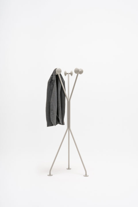
Mdd a Polish brand specializing in office furniture presented during Orgatec “Ramo”. A coatstand reduced to the minimum of element resuting in a lightweight steel construction with knobs made of solid ash wood will provide a steady support for coats and other hanging items.

The monochromatic three-armed shape was designed in a se- lected range of neutral colours.It is made using steel and ash wood, which are both environmentally friendly and recyclable.

Lightness of Being

Hermès
Window design
2022

The annual theme Lightness is approached through humour, geometric shapes evoking human-like figures in movements while stretching out, walking, lacing shoes, etc. A celebration of the “joie de vivre” through expressive shapes, vibrant colours, distinctive textures and humour. The background panels are covered in discontinued textiles creating a 2D/3D play between the flat surfaces and the figures.

Entwine vase

Trame Paris
Product
2021

The lines are at once timeless and relevant, creating and appreciating a sense of beauty through harmony and proportion.
The vase is made in mediterranean terracotta clay and hand moulded in Morocco

Fashion Accessories Finalists

Villa Noailles
Exhibition design
2021

Exhibition design showcasing the works of the 10 fashion accessories finalists part of 36th International Festival of Fashion, Photography and fashion accessories in Hyeres, France.

Le 19M prize

Villa Noailles
Exhibition design
2021

Exhibition design for the 36th International festival of Fashion, Photography and fashion accessories – Laureates 2020 le 19M prize Métiers d’art de la mode – Chanel. The Villa Noailles commissioned Jacques Merle to draw the laureates’ projects and Romain Laprade shot the collections designed by: Emma Bruschi, Tom van der Borght, Juana & Ddiddue Etcheberry (Owantshoozi)

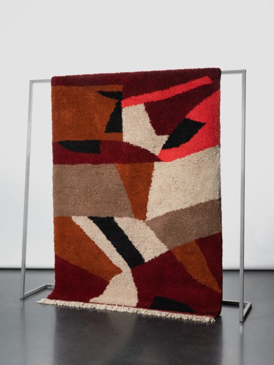
Entwine rugs

Trame Paris
Product
2021

The ENTWINE collection shows a more random application of colors and lines, the poetic of the grid is still there but the design is moving towards its decomposition. The cross-cultural contamination is celebrated by a tangled complexity of elements.

100% natural berber wool hand-knotted in Morocco

Arco

AHEC x Benchmark
Furniture
2020

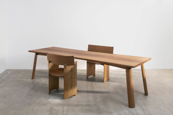
When the onset of Covid-19 significantly changed the way people live, interact and work, creatives and makers had to adjust their processes using new technologies to work together at a distance and often operate from new, improvised, home offices. The American Hardwood Export Council (AHEC), Benchmark Furniture and the Design Museum challenged nine designers to create a table and seating for their personal use, to suit their new ways of living and working from home. 
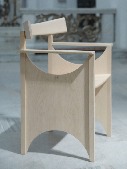
The Arco seat and table draw inspiration from sculptural forms, Shaker furniture and the works of Dom Hans van der Laan. With a focus on a prominent curve, the table uses prime American cherry wood with care- fully grain-matched and machined planks.
The chair is sculptural and mimics the curves of the body. Rather than designing a chair, I wanted to create a seat that would function as a piece of architectural furniture. I chose to use only one shape: a curved sur- face, repeated horizontally and vertically to form both the seat and the table.
An exaggerated backrest provides a symbolic boundary and territory. This is particularly significant when one has to create a working environment in spaces that weren’t designed for that purpose. The chair’s shape nearly mimics the body’s posture of claiming a space by extending one’s arms to the side, parallel to the ground. In general, I like to think of ‘things’ as pros- thetic pieces, as extensions of our bodies.
While appearing structurally simple, the construction choices (such as frame matching) showcase a high de- gree of manufacturing proficiency. The table’s angled legs are an unusual quarter-moon shape and create tension through the tabletop using inset metal plates. The side panels of the chair are coopered – a technique drawn from barrel-making, and the entire piece is a celebration of the hardwood’s beauty.
The project is part of Connected on show at Design Museum in London until October 11th, 2020. The designers involved in Connected are: Ini Archibong (Switzerland), Maria Bruun (Denmark), Jaime Hayon (Spain), Heatherwick Studio (UK), Sebastian Herkner (Germany), Maria Jeglinska-Adamczewska (Poland), Sabine Marcelis (Netherlands), Studiopepe (Italy) and Studio Swine (UK / Japan).
www.connectedbydesign.online

Oda, Kari, Lotta blankets

Puro Hotels x Røros Tweed
Product
2020

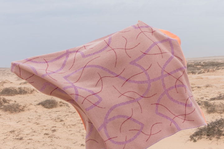
Røros Tweed, a Norwegian manufacturer of high-quality wool products since 1940, based on a centuries-old local crafts tradition, and outstanding Polish designer Maria Jeglińska- Adamczewska have joined forces with PURO Hotels in a brave new project. PURO has never been afraid to strike out into new territory, to find innovative combinations of its great passions – art, design, and hospitality – to create hotels not only con- ceived by and collaborating with the local creative communi- ties, but also keeping in steady contact with them. Now PURO has embarked on a new project of wearable throws that com- bine folk tradition, contemporary style, and cultural diversity in a way that stimulates the senses and lets you wrap yourself up in a cozy and stylish bundle.
The founder and creative director of the PURO brand, the Norwegian-born Rune Askevold, for many years now a proud resident of Warsaw, has found a novel way of bridging his two countries. In 2019 Maria got started on the project, visiting the Røros headquarters, where she was made acquainted with their production capabilities. The collaboration resulted in a collec- tion of three blankets thought as wearable throws that dress as much the wearer as the interior – an oversized scarf or a soft composition. Once woven the three colour yarns blend in and create unexpected shade variations. Designed as large compositions highlighting the pictorial qualities offered by jacquard weaving. All the throws use 100% Norwegian wool and are made in the town of Røros. The volcanic landscape of the Canary Islands became the backdrop for the photographs taken by Robert Świerczyński.
Lotta will be gracing all the rooms of Krakow’s Old Town PURO, which has just seen a major renovation. For more information please visit: www.purogiftshop.pl

Entwine bowls

Trame Paris
Product
2020

In ENTWINE ceramics by Maria Jeglinska the lines are at once timeless and relevant, creating and appreciating a sense of beauty through harmony and proportion. A voluptuous roundness beautifully sits on a pedestal that celebrates the encounter between contemporary design and artisanal tradition.
Hand-thrown in Morocco in mediterranean terracotta clay.
More information here

Awangarda-Patterny 1920-2020

Self-Initiated
Drawings
2020

„Patterns of the Avant-Garde 1920-2020”. A series of drawings and patterns inspired by the Polish interwar period, in particular the Polish pavilion at the International Exhibition of Modern Decorative and Industrial Arts in Paris in 1925 and the Praesens group, which operated until 1939. The first series is inspired by Zofia Stryjeńska’s work for the Polish Pavilion in 1925. The second series is inspired by the architecture of the Polish Pavilion by J. Czajkowski. The final series is inspired by the Praesens Group. Made possible thanks to a scholarship from the The Ministry of Culture and National Heritage of the Republic of Poland. 

Projekt Awangarda-Patterny 1920-2020, cykl wzorów (patternów) inspirowanych okresem międzywojennym, w szczególności Polskim pawilonem na Międzynarodowej Wystawie Sztuk Dekoracyjnych i Wzornictwa w Paryżu w 1925 r. i grupie Praesens, która działała do 1939 r. Pierwszy cykl jest inspirowany twórczością Zofii Stryjeńskiej dla Polskiego Pawilonu w 1925 roku. Drugi cykl jest inspirowany architekturą polskiego pawilonu proj. J. Czajkowskiego. Ostatni cykl jest inspirowany grupą Praesens. Zrealizowano w ramach programu stypendialnego Ministra Kultury i Dziedzictwa Narodowego – Kultura w sieci”.

Arena Design

MTP
Creative direction
2020

Entwine blanket

Trame Paris
Product
2020

TRAME’s 1st collection is freely inspired by the story of Madame de Blois and her imagined connection to Moroccan culture.
In the scenario envisaged, Madame is gradually surrounded by the occurrence of more chaotic elements, reflecting a new approach in the dialogue with the multifaceted local culture.
The ENTWINE collection of blankets by Maria Jeglinska shows a more random application of colors and lines, the poetic of the grid is still there but the design is moving towards its decomposition. The cross-cultural exchange is celebrated by a tangled complexity of elements.
Art direction: Studio Vedet (Valentina Ciuffi & Alice Zani)

Series 3

Plato
Furniture
2019

The starting point was to create a collection based on a system that was universal enough to suit as many contexts as possible, from a classic wardrobe in a bedroom to a bookcase that would perfectly „make” the living room.
The construction of the entire Series 3 was based on a system of aluminum profiles. The leitmotif was corrugated glass, which gives a coherent rhythm to the whole and is one of the key decorative elements. The grooves continue in the form of carved drawer fronts made of solid wood. Throughout the design process, ergonomic aspects were as important as the joy of use. Many of the freestanding accessories will also work well in a living room. What is important is that the system allows you to combine many storage functions. In small spaces, a great solution may be to combine a wardrobe and a bookcase with a desk space.
Collection to be launched in the 2nd quarter of 2020.

Bellevue Bench

Fiskars Village Biennale
Furniture
2019

Bellevue was designed upon the invitation of Jasper Morrison, curator of the exhibition “Social Seating”, where 18 designers were invited to design and build a bench for the Fiskars Village Biennale. The exhibition is located outdoors along the river in Fiskars between the two venues of the Biennale.
BELLEVUE is inspired by archetypal 19th c. metal benches. It is a flatpack 2m-long bench made out of aluminium parts. Three disctint vertical profiles, with emphasized armrests on the extremities, support the horizontal aluminium extrusions. 
Then the colour comes a contrast with the rather classic shape of the bench, creating a background for the sitter. The bench is ultimately a tool which provides a view onto the surrounding context. A vantage point between private and public space for the flaneur. 


Social Seating curated by Jasper Morrison 
Comissioned by Fiskars Village Biennale 
May 19th-Sept 15th, 2019

Portable Walls

Museum of Decorative Arts
Exhibition
2019

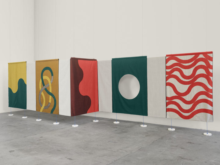
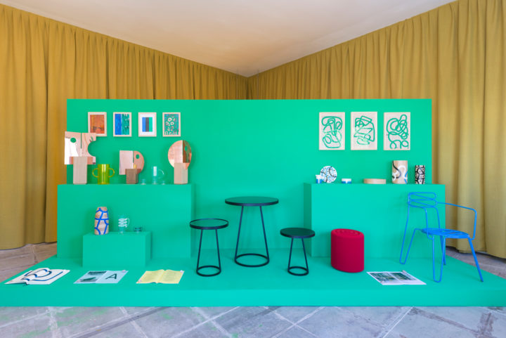
The Portable Walls collection is inspired by the architectural characteristics of Sándor Mikó’s armchair – reduced to a sign that can be read as either a 2d form or a 3d shape. The armchair’s style is extremely succinct – it functions as a symbol, a pictogram of an armchair while serving the primary function of supporting the sitter’s body. 

Studies on walls that support us when traveling in space. Portable Walls are objects which serve to create a context for other items. After all, it is the context that defines a designed object’s value and importance: their original purpose is to co-function with other items in specific spaces and to accompany us in our daily lives. 

The collection includes four “walls” which create a landscape of free-standing vertical or horizontal surfaces. They are abstract forms which do not point to a specific function, but rather offer freedom in choosing the way they are used and arranged. The portable walls’ distinctive feet were directly inspired by those of Mikó’s armchair and imply (with a dose of humor) the idea of movement. 

While different items may be displayed on the Portable Walls, they are also objects in themselves. They can be used to partition spaces or, with their assigned functionality removed (the piece of furniture and its content), be situated in another space. Portable Walls can function as some combination of museum display plinths, walls, pieces of furniture, theater props, and backdrops that support us in the activities which constitute our day. Motion is part of their form. 

In Circulation: Maria Jeglinska, 21 March – 9 June 2019, György Ráth Villa, Budapest
Exhibition and project commissioned by The Museum of Applied Arts in Budapest supported by the Adam Mickiewicz Institute and the Polish Institute.


Patterns

Print Control
Publication
2018

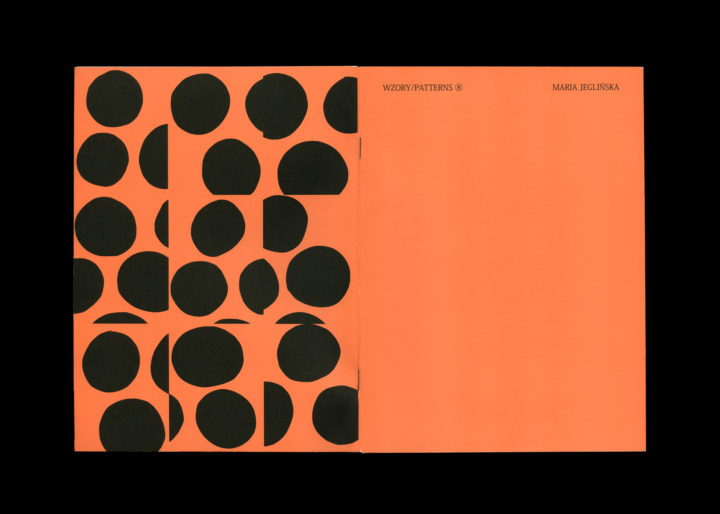
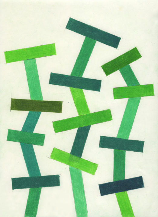
These geometric compositions are made up of simple hand drawn geometric forms: lines, circles and grids. The latter are contrasted with abstract forms drawn upon a grid. 

As an (industrial) designer I always work within a framework and thus I decided to focus on a simple vocabulary of forms arranged in and on a grid. A constraint I set to myself within the plethora of possibilities. This surely comes from my designer’s background, the idea of creating a system out of one element and explore all its possibilities when multiplied… Afterwards I started reconfiguring these arrangements in grids of various divisions. As if a camera was zooming in and out of them. 

But above all the other element that was pivotal and even more important was the in between space. It created unexpected 2-dimensional architectures. If I were to sum up in one sentence what these compositions are about it would be: the arrangement of the space in between.

Vase Man

Autor Rooms
Product
2018

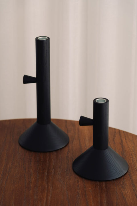
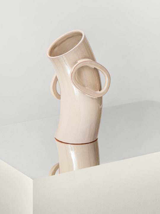
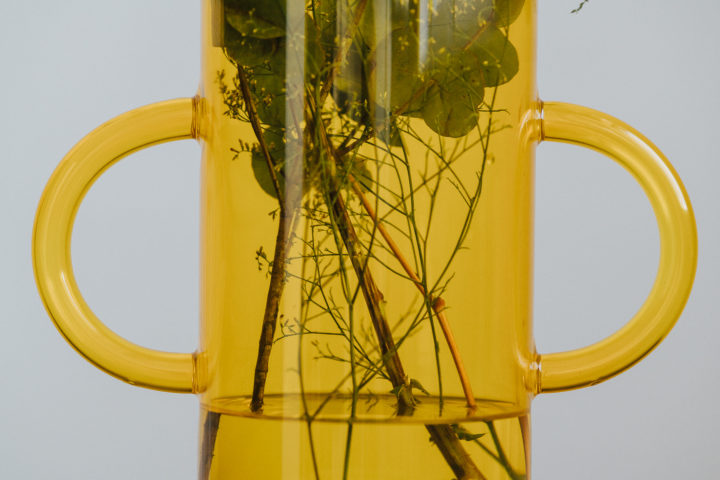
The latest addition to the hotel essentials collection, a vase, expands on the formal language of the glassware and of the mirrors designed for Autor Rooms. It is a body in the form of a large tube, the bottom sphere reminds legs, standing still and firmly. On each side, semi sphere-shaped tubes recalling the body language of power posing resemble hands. And then comes the most important, the head impossible to grasp, ultimately defined by the owner of the Vase-Man. Sometimes it is leafy, sometimes colourful, which exults a fresh aura, at times modest or of a royal presence. A welcoming presence.
Portable Landscape

Concept
Product
2018

In the age of infinite data volume, acceleration and hyperconnectivity, we frequently move throughout the day between rooms with assigned functions and designated activities.
This results in a growing need to reconnect with the natural elements. The objects comprising The Portable Landscape, a collection designed by Maria Jeglinska, serve this very purpose. They aim to provide freedom and variety in our interiors, enabling us to repeatedly enter a space as if for the first time and to continually rearrange its contents adapting to our needs. 
Portable side tables, which can also serve as stools, offer many possible functions and options – to pause, reflect, regenerate. Planters and similar elements can be simultaneously used to form small, natural oases in a room, delineating more intimate areas within a larger space.. The order of panels can be continually repositioned. 

Space Time

Villa Noailles
Publication
2018

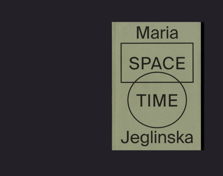
SPACE TIME, the film that preferred to be a book. 
A book is a space time sequence.
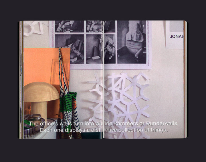
The publication is the continuation of the exhibition “Arrêt sur Image”, which took place at the Villa Noailles in the summer of 2017 and opened during the Design Parade Festival. The exhibition presented a pause in an emerging sequence through 3 walls showing the various facets of the office: design, drawing and research. 
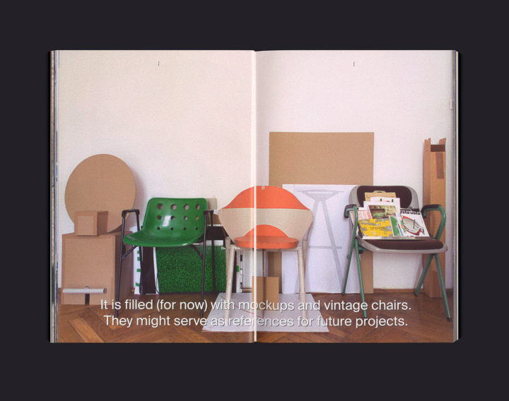
SPACE TIME gives insight into Jeglinska’s practice presented in the form of a three-chapter film. Subtitles on the pages guide the viewer/reader and slowly introduces the audience to Jeglinska’s world. The publication starts within the four walls of the office, showing the physical space and then bounces to works in the field of product and furniture design, exhibition. It also explores her curatorial projects completed since setting up her own office 6 years ago. The film/publication shows works created for clients such as Ligne Roset, Kvadrat, 1882 ltd, Autor Rooms, London Design Biennale and the Museum of Modern Art in Warsaw.
Olivier Lebrun, a long time collaborator with whom Jeglinska realized in 2010‘s “the Lift & the Space/Object”, designed the publication. Contributions include “The World Famous Drinking Chair,” a short story about Jeglinska’s 2014 “Little Black” chair by Disegno Magazine Editor-in-Chief Oli Stratford, and an exclusive series of photographs by Katrin Greiling commissioned especially for the publication. Published by Villa Noailles

Background(s)

Kvadrat
One-Off
2017

The temporary wall as a backdrop.

When working on exhibition designs, I often have to deal with the challenge of designing the background in such a way as to highlight the exhibited artefact.

Background(s) is a series of large and small panels hung from the ceiling and connected to each other to form a continuous 10 meter long surface. It can be freely arranged in space to respond to social forms and encourage human interaction. Neither object nor architecture but an extension of both, Background(s) is a spatial device that frames situations. It can contain, divide or be rearranged, and exposes everyday events through colour, surface and tactility.
As a design material, textile has the great advantage of being easily scaled: from micro to macro. The weave structure of Canvas lends itself to vibrant, geometric, cut-out figures, which are then sewn onto the surface of the large panels. The order of panels can be continually repositioned.

Commissioned by Kvadrat 
Curator: Constance Rubini
Canvas Textile by Giulio Ridolfo

Arrêt sur Image

Villa Noailles
Exhibition
2017

The major concern is not reality as it is but the search for an all‐around idea, for a general content, a coherent thought, or an overall concept that ties everything together. Oswald Mathias Ungers Morphologies.
City Metaphors (1st edition, Cologne, Buchhandlung Walther König, 1982).
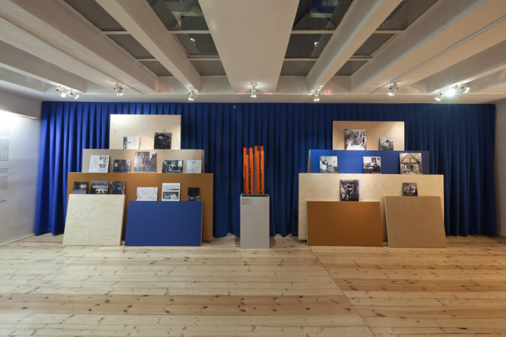
Exhibiting without immobilising. Up against the wall, Maria Jeglinska is anxious to see the current work take form. Because it is her whole world which is united here, suspended. The curves of the chair, Little Black relate the effervescence of Polish cafe terraces from the end of the 1960s, a fragment of the past from her native country, where she now lives and works. The curves of the welcoming copper mirrors from the “Hotel Essentials” collection react to those of the Goodies Stools. The coffee service The Nightingale shares the fable which inspired its title and which one might think was written for these designers as a reason for meditating: a Chinese emperor who preferred the song of a mechanical nightingale to that of a real bird. All of these projects express her taste for drawings, which darken the pages of research notebooks, and cover the pages of magazines and the turned wood vases. These distinct and sharp lines trace in space a table, a chair, and a handle. The different parts — “servant and served”, one might say in architectural terms — are clearly stated and organised. Thus the tabletop is removable, clamps extend from a cup and serve as handles. However, there is nothing puritanical about this act of reduction. The sketches which Maria Jeglinska instinctively undertakes in order to “think without intellectualising” willingly assume a joyful and decorative character, where suitable.
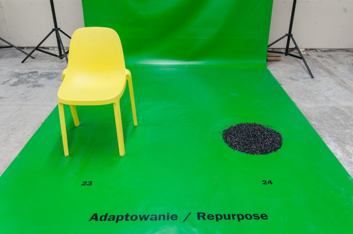
This universe can be hung from the wall, but the system behind the presented objects wishes to be a freeze frame, a pause in an emerging sequence. It is not a question of establishing rigid classifications, but of making visible a landscape of labour. A film compiles the more or less fortuitous arrangements between the objects at different stages of their development in the designers workshop. The images, models, prototypes, and additional elements compose an ever changing installation. Memories which reside in the designer are hinted at: André Breton’s surrealist wall, Atlas Mnémosyne by Aby Warburg. A picture rail is less of an architecture than it is an imaginary space, which is just as comparable to the Wunderkammer of the Renaissance as it is to these galleries of digital images, which are the treasure troves of contemporary amateurs. A green screen — normally used for compositing computer graphics — points at these virtual potentials.
With, “Wonder Cabinets of Europe” Maria Jeglinska and her associate Livia Lauber invited their peers to box in their processes of creation, their methods, and their raw materials. Visitors to “Cadavre Exquis: an Anatomy of Utopia” (Klara Czerniewska, co-curator) and “Ways of Seeing/Sitting” were invited to explore a physical space which materialised an interactive narration. The first exhibition was constructed like a “game where you are the hero” and where there was nothing to win. The second resembled pairs of objects which illustrated a concept, from an archetype to open- source. One sensed that their encounter was like a pause in a potentially infinite scrolling. These exhibitions played upon metaphor, analogy, allegory: visual thinking, that is necessarily fluid, and gives prominence to polysemy and heuristic concertinaing. This morphological paradigm, described by Oswald Mathias Ungers, amongst others, underlies Jeglinska’s work for Design and Research, that is mise en abyme here.
Juliette Pollet

Cadavre Exquis

London Design Biennale
Exhibition
2016

Cadavre Exquis: An Anatomy of Utopia
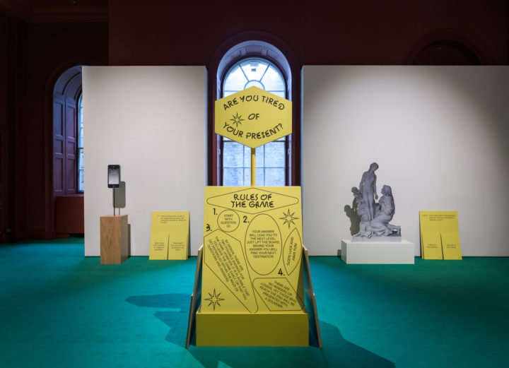
Created especially for the London Design Biennale, Jeglinska and Czerniewska’s installation questions how the 21st century creates space for new utopias as it reflects on the numerous crises and failures of modernist social, political and urban projects from the previous century. Borrowing from the form of the surrealist word association game, the exquisite corpse, it invites the viewer to act as a co-creator of a proposed narrative. 
By assuming the role of the wanderer, visitors will face the choice between their own path towards an idyllic utopia or a disturbing dystopia. Whether their vision will be positive or negative will be up to them. The journey examines questions relevant to the current era and the collective search for a new utopia. Does the age of diversity allow space for idealist uniformity and totality? How can Utopia be designed? Is it possible to devise an algorithm to generate a utopian future? 
By confronting two streams of (un)consciousness, Jeglinska and Czerniewska have chosen six concepts relating to the problems of the world of today. Distilled to abstract ideas (cloud, sun, house, high-rise, fossil, artificial intelligence) and presented in unexpected juxtapositions, these notions comprise fragments that amount to a symbolic anatomy of Utopia as an inventive tool for change. 
Commissioned by Culture.pl 
Curated by Klara Czerniewska & Maria Jeglinska 
Design Team: Maria Jeglinska (installation); Krzysztof Pyda (visual identity); Kaja Kusztra (epilogue); Paweł Andryszczyk (sound) 
London Design Biennale, Somerset House, 07.09-27.09.2016 

The Nightingale ceramic collection

1882ltd
Product
2016

The “Nightingale” is a tale written in 1843 by Andersen and tells the story of Chinese Emperor who prefers the tinkling of a mechanical bird (who eventually breaks down) to the song of a real nightingale. 

“The Nightingale” pattern is composed of two surfaces treated differently one involving a mechanical reproduction of a hand drawn pattern and a second one performed by a skilled crafstman. The latter is hand glazed and does not involve a delibarate decor. It is beautiful in its imperfection. Though different, both surfaces at some point involved a hand generated pattern. 

The set is built on contrats of techniques and surfacing: a precise hand drawn decor versus abstract surfaces which form chance patterns. It is precisely that contrast that interests me. 

The coffee collection comprises: a Sugar Box, Creamer, Demitasse Coffee Cups and Saucers, plate 

Production discontinued

Circles Tables

Ligne Roset
Furniture
2016

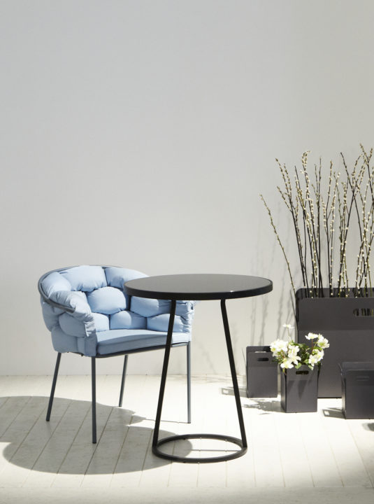
A steel structure standing on two legs, independent from its top. The tables respond to today’s increased need for flexible pieces. They can be easily moved around, and adapt to the users’ various activities. Not being the central objects in space, they rather aim to complete existing ones. 
After the successful launch of the Circles side tables in 2010, the collection extends with a third member. For the taller version a removable glass top was used to allow it to be used in a variety of environments: outdoor, indoor, residential… 

The Faces of Autor

Autor Rooms
Product
2016

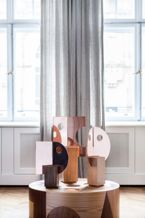
For each of these objects, I tried to imagine people’s arrival at Autor Rooms and how they would relate to the space. Guests and visitors interact with the space for a limited amount of time. Therefore, materials were chosen for their warmth and how they relate to the space. First and foremost, they needed to convey a deep sensory sensation. Three copper presences greet guests upon arrival. These large, face-shaped, polished copper-surfaces mounted on square wooden bases appear to playfully wink at anyone entering the room.
The vocabulary of forms developed throughout these essentials are simple geometric shapes. Materials were selected for their warmth and accentuated with generous shapes. Ultimately these faces, objects and materials are there to provide you with simple joys. Small tactile and visual pleasures for the mind and the body. They are the symbols of hospitality.
The Autor Rooms’ Hotel essentials are made up of a set of The Faces of Autor three free-standing mirrors, a carafe and a glass set, a tray, a doorknob, a shelf and a wall-mounted mirror.
The collection is available here
Project assistant: Maja Szczypek

Hotel Essentials

Autor Rooms
Product
2016

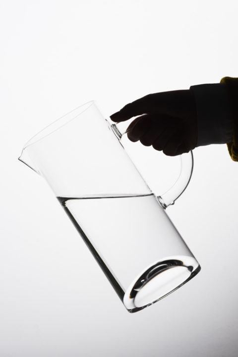
“For each of these objects, I tried to imagine people’s arrival at Autor Rooms and how they would relate to the space. Guests and visitors interact with the space for a limited amount of time. Therefore, materials were chosen for their warmth and how they relate to the space. First and foremost, they needed to convey a deep sensory sensation. Three copper presences greet guests upon arrival. These large, face-shaped, polished copper-surfaces mounted on square wooden bases appear to playfully wink at anyone entering the room. The wooden tray’s massive rim highlights the ash wood’s grain. The bases of the glassware are shaped to reflect a maximum of light, while invoking the concave underside of a wine bottle. The robust glasses sit elegantly in your hand. I initially designed the wooden doorknob for the sliding bathroom doors. Later, the idea evolved to also inspire the shelves and a the wooden brackets supporting the mirror.
The vocabulary of forms developed throughout these essentials are simple geometric shapes. Materials were selected for their warmth and accentuated with generous shapes. Ultimately these faces, objects and materials are there to provide you with simple joys. Small tactile and visual pleasures for the mind and the body. They are the symbols of hospitality.
The Autor Rooms’ Hotel essentials are made up of a set of The Faces of Autor three free-standing mirrors, a carafe and a glass set, a tray, a doorknob, a shelf and a wall-mounted mirror.
The collection is available here
Project assistant: Maja Szczypek

Art, Incidentally

Museum of Modern Art Warsaw
Exhibition design
2014

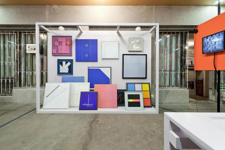
“In the past, WARSAW UNDER CONSTRUCTION festival dealt with architecture and its designers, advertising in the public space, and participation processes. And now, the time came for artists. Warsaw of the year 2014 is a centre of the Polish artistic life, being the seat for the most important Polish cultural institutions, commercial galleries and cultural periodicals. Every month, Warsaw witnesses dozens of new exhibitions, book presentations, performances, discussions and film shows. As a result of symbolic installations in the city public space (such as Greetings from Aleje Jerozolimskie by Joanna Rajkowska or The Rainbow by Julita Wójcik), Warsaw art is commented on the front-pages of the biggest papers, and is well-known to the city inhabitants. Through their lifestyles, also artists themselves set trends that, after a while, become popular in the society as a whole or in some of its sections. Thus, artists and their art play an important role in emancipatory processes.”
(excerpt from the curator’s statement). 
Exhibition curated by Klara Czerniewska

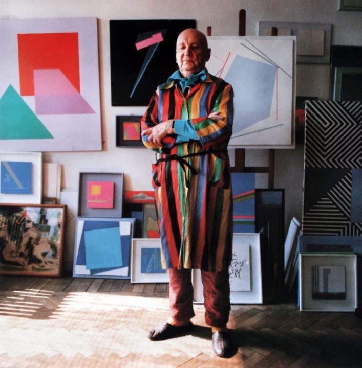
Henryk Stażewski. Always There

Museum of Modern Art Warsaw
Exhibition design
2014

“In the past, WARSAW UNDER CONSTRUCTION festival dealt with architecture and its designers, advertising in the public space, and participation processes. And now, the time came for artists. Warsaw of the year 2014 is a centre of the Polish artistic life, being the seat for the most important Polish cultural institutions, commercial galleries and cultural periodicals. Every month, Warsaw witnesses dozens of new exhibitions, book presentations, performances, discussions and film shows. As a result of symbolic installations in the city public space (such as Greetings from Aleje Jerozolimskie by Joanna Rajkowska or The Rainbow by Julita Wójcik), Warsaw art is commented on the front-pages of the biggest papers, and is well-known to the city inhabitants. Through their lifestyles, also artists themselves set trends that, after a while, become popular in the society as a whole or in some of its sections. Thus, artists and their art play an important role in emancipatory processes.” (excerpt from the curator’s statement). 
Exhibition curated by Klara Czerniewska

Little Black outdoor collection

Furniture
2014

The project refers to the Warsaw cafes that were created between 1955 and 1965. A period which saw the renaissance of socialising over a cup of coffee. ‘Mała czarna’ is a nickname for coffee which translates as ‘the little black’, hence the name of the collection. 

A common feature was to furnish these cafes and bars with metal wire furniture designed by either architects or designers. The aim of this collection is to recreate – in a utopian way – a disrupted continuity. To find the essence of what could have been a Polish design identity. The project tries to look into the future but with an understanding of the past. 

Due to the lack of material and technological capabilities this has resulted in finding solutions with minimal resources (in terms of form and use of material). To date, the most associated is the “Polish Poster School”. Lines were directed on a piece of paper in such a way to be able to narrate the maximum using minimum means. As seen in the works of Henryk Tomaszewski, Jan Mlodozeniec. 

On the basis of two elements the entire collection is formed, which consists of: a chair, an armchair, a stool, a bar stool and tables. Following this line of reasoning the distinctive form of the collection was shaped.

Acquired in June 2022 into the permanent collection of the Vitra Design Museum in Weil Am Rhein

Drawn Objects

Self-commissioned
Product
2014

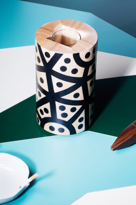
My research in that case always starts with endless drawings. It also helps me to develop a language that later might be applied on serially produced objects. They could be compared to musical “études”, that help me shape a language. A daily training of the hand and the mind in order to keep them fit. Wood is immediately recognizable, Its tactile, visual and olfactive qualities cannot be denied. 
My recent fascination for patterns, motifs was also one of the primary motive for this project. Here patterns are treated in two ways: inherent to the object’s form (3d) and applied onto the form (2d). I wanted to keep the object’s use extremely simple, so obvious that you almost stop looking at them through the function they are meant to perform. A simplicity that tries to transcend the objects function. 
You are never truly sure of the outcome produced, doubt is an inherent basis of this kind of projects. You never know what its “music” will sound like in the end. But precisely this interests me, to leave space for the unknown and try out things, even if they are failures… On industrial projects the tools and the process we use allow us to predict every mm of the object. Here the manual skills of the wood-turner and mine (for the hand-painting) determine the final quality of the object. 
Materials: Acrylic and waxed ash 

Ways of Seeing/Sitting

Lodz Design Festival
Exhibition
2012

Each context defines its way of sitting, like each society defines its set of rules within which it operates. Beyond its end purpose, each object raises a number of issues, including production, environment, culture, and socio-political considerations, global and local production.
By presenting thirty-two produced objects this exhibition explores the ongoing changes in the Man-made world. Sixteen seats are placed next to sixteen objects. Each pair consists of a “chair” juxtaposed with another object – its “analogy”. The goal is to extract the main characteristic common to both of them: the “idea”. The exhibition is thought out as analogue software: a system of representation operating with tags and associations, where a seat guides a category (the idea), which, in turn, defines the object (the analogy).
Show curated & designed for the Łódź Design Festival (Poland)
18.10.2012 – 28.10.2012

Goodie

Ligne Roset
Furniture
2012

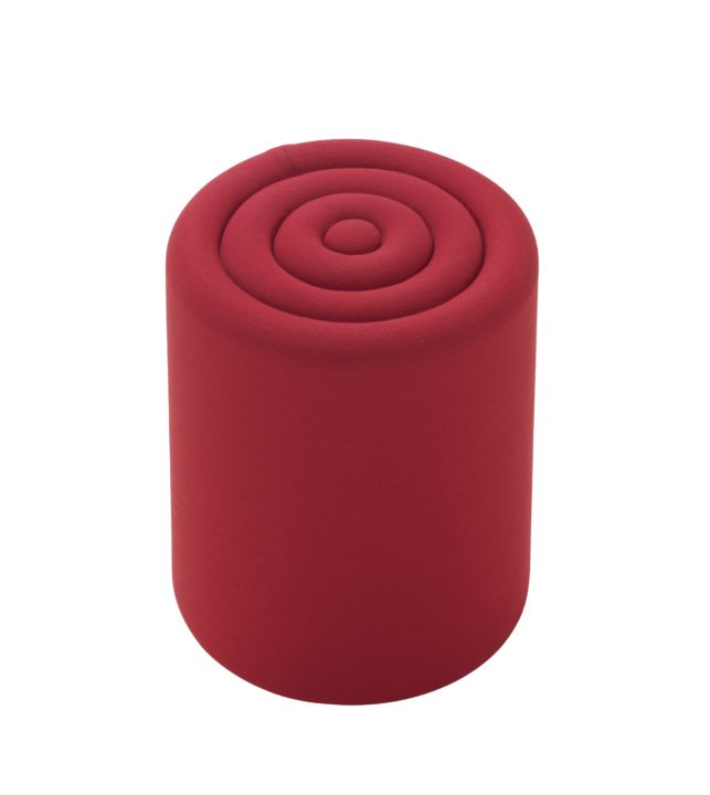
Goodie is an upholstered stool based on the same formal construction principles that were applied on the previous pieces for Ligne Roset (Maré lamp & Circles tables). 

Tie glassware

DesignMarketo
Product
2011

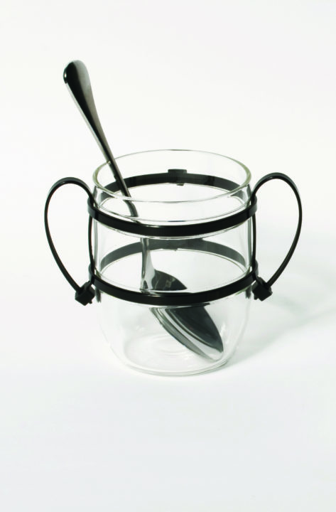
The TIE range is based on two separate elements: a glass container and handles. A simple gesture of tying plastic ties around a vessel in order to achieve handles. 

Commissioned by DesignMarketo for the Barbican Art Gallery 

Maurizio

DesignMarketo
Product
2011

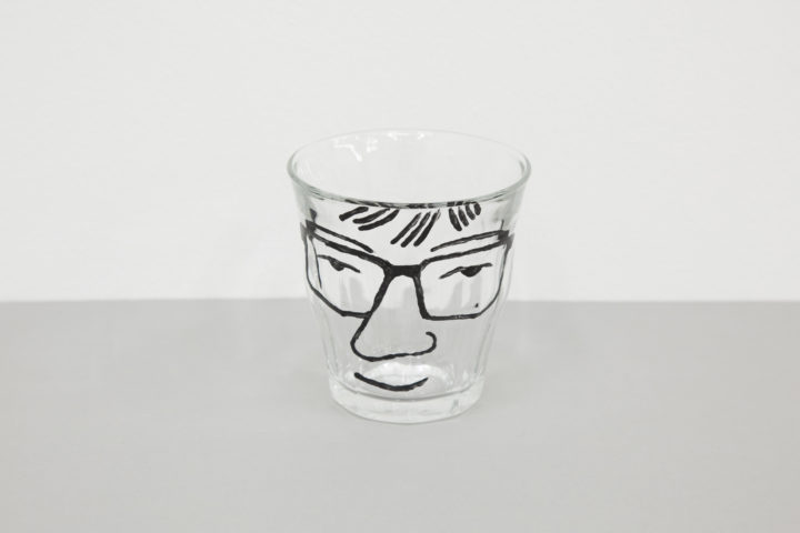
The beautiful and perfect Duralex tumbler meets Maurizio from Bar Basso. Conceived as a souvenir of the event rather than a reinterpretation of the iconic glass. Commissioned for the event „Bar Alto” during London Design Festival in September 2011.

Disneymotionland

St Etienne Design Biennale
Film
2010

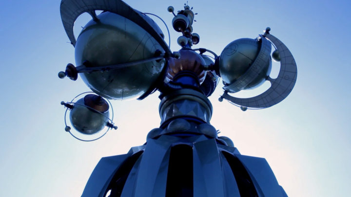
It is a short study filmed in Disneyland, Paris. Assuming that almost all forms of transport mankind created exist in this corporate microcosm (ferry, cars, trains, spaceships, roller coasters, etc). Some being pastiche representations part of the entertainment, and some developed for the parks and designed by Disney’s Imagineers to help the visiting guests to commute from one attraction to the other.
Film realised in collaboration with Zaq Foltest with music by Marcin Masecki.
Commissioned for the exhibition “la Ville Mobile”, curated by Constance Rubini for the St Etienne Design Biennale.